The website FiveThirtyEight covers a variety of news from sports, politics, and economics. However, they are also well known for their visualizations. There is even a FiveThirtyEight style sheet in the Matplotlib library.
import matplotlib.pyplot as plt
plt.style.use('fivethirtyeight')
Using figure/axes syntax, you can also create attractive visualizations. Every plot has an outer section called the figure or background, and the inner section is referred to as the axes (or subplot if displaying multiple axes). Learning the anatomy of a plot allows you to manipulate it’s features.
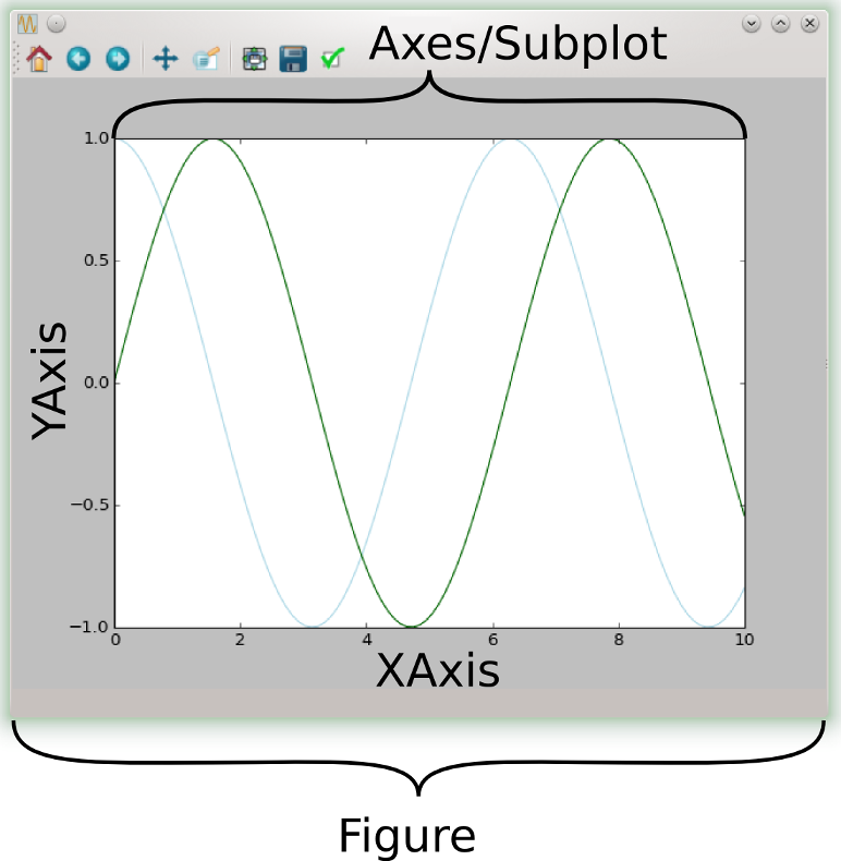
Start by generating figure (fig) and axes (ax) objects. fig, ax = plt.subplots() Now calling on fig or ax allows you to customize or control any aspect on the plot.
# set figure background color
fig.patch.set(facecolor='xkcd:mint green')
# change the axes to yellow
ax.set(facecolor="yellow")
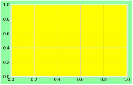
Okay, that’s a flashy combination, but you get the point. You can manipulate numerous features of a plot to make your visualization express what you would like your audience to see. Here are a list of axes attributes that might come in handy:
- Title
ax.set_title("Title Name Here", fontsize=20) - Legend
ax.legend() - X axis label
ax.set_xlabel("X axis label") - Y axis label
ax.set_ylabel("Y axis label") - Major and Minor Ticks
ax.set_xticks() - Major and Minor Tick Labels
ax.set_xticklabels() - Spines
ax.spines['right'].set_color('none')
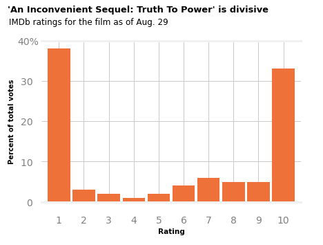
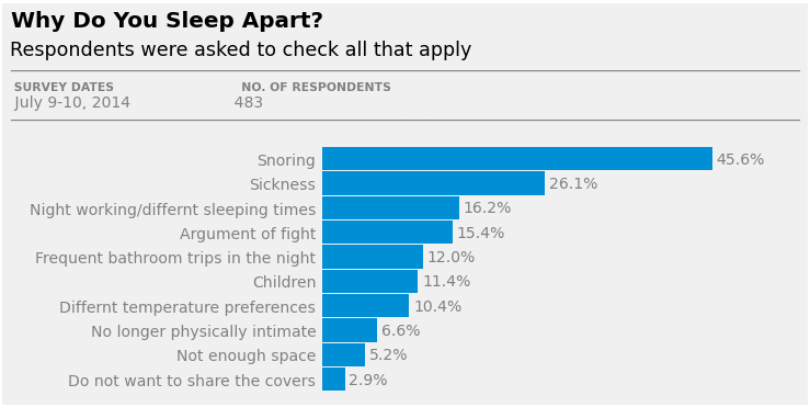
Here a two charts I found on FiveThirtyEight.com that I decided to reproduce. The first is a vertical bar graph that plots distribution of ratings for the film “An Inconvenient Sequel: Truth to Power”. The second was a bit more challenging. It’s a horizontal bar graph of the reasons why couple sleep apart.